Toyoda Gosei Czech, from a single logo to a full rebrand
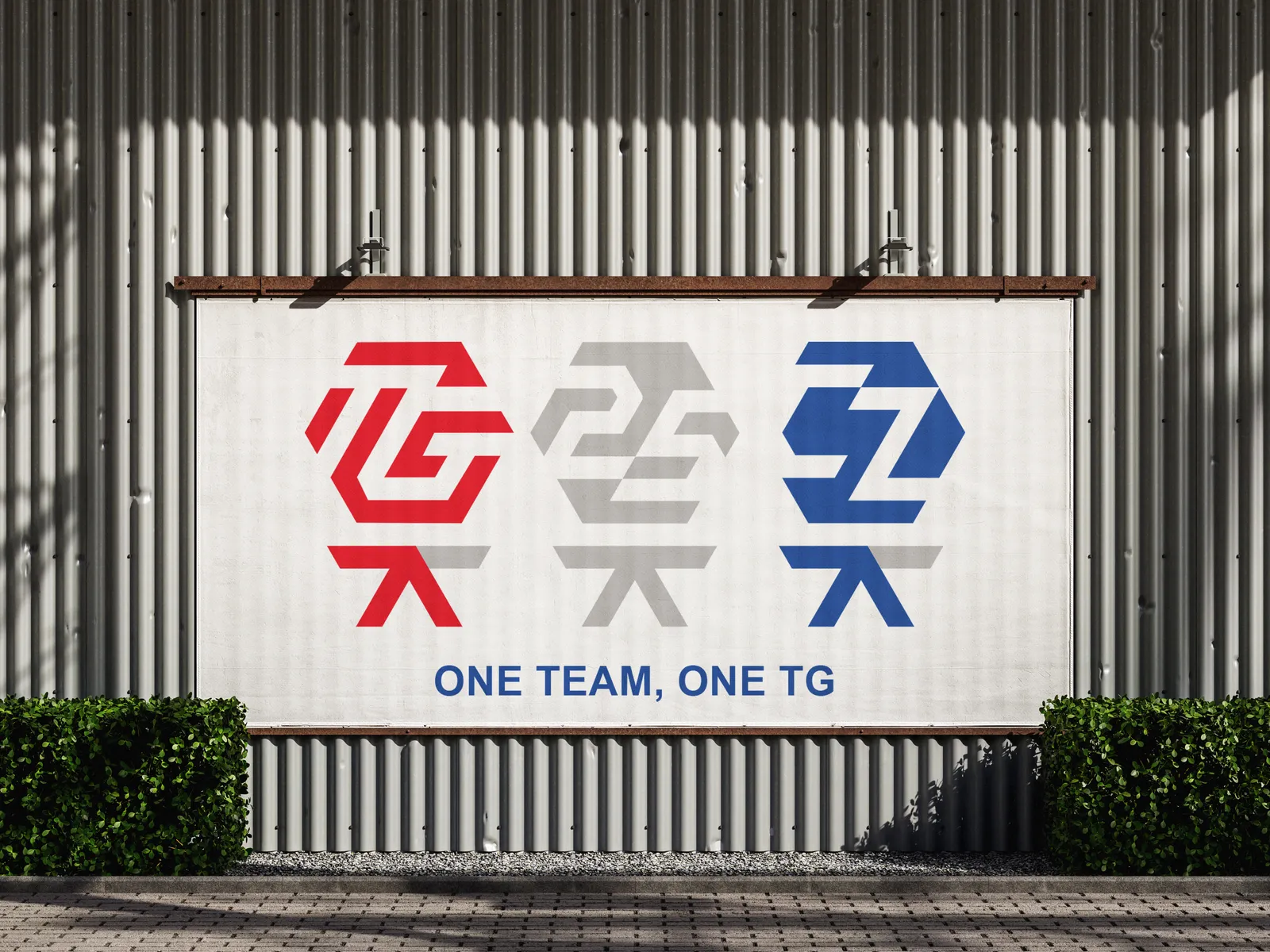
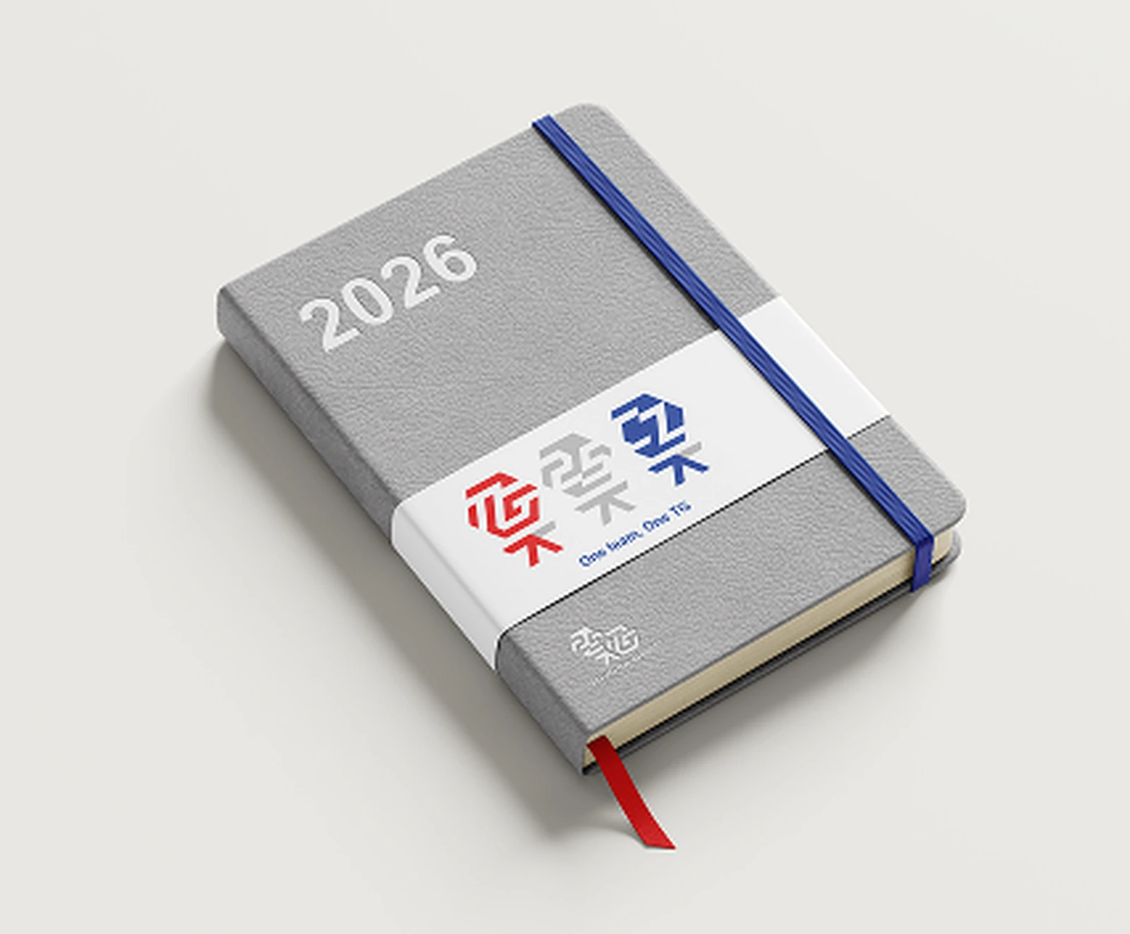
It started simply. Toyoda Gosei Czech needed an anniversary logo to celebrate 25 years in the Czech Republic. We designed the primary logo along with a set of variants to give it flexibility across different applications. The client was pleased, and that first project opened the door to something much bigger.
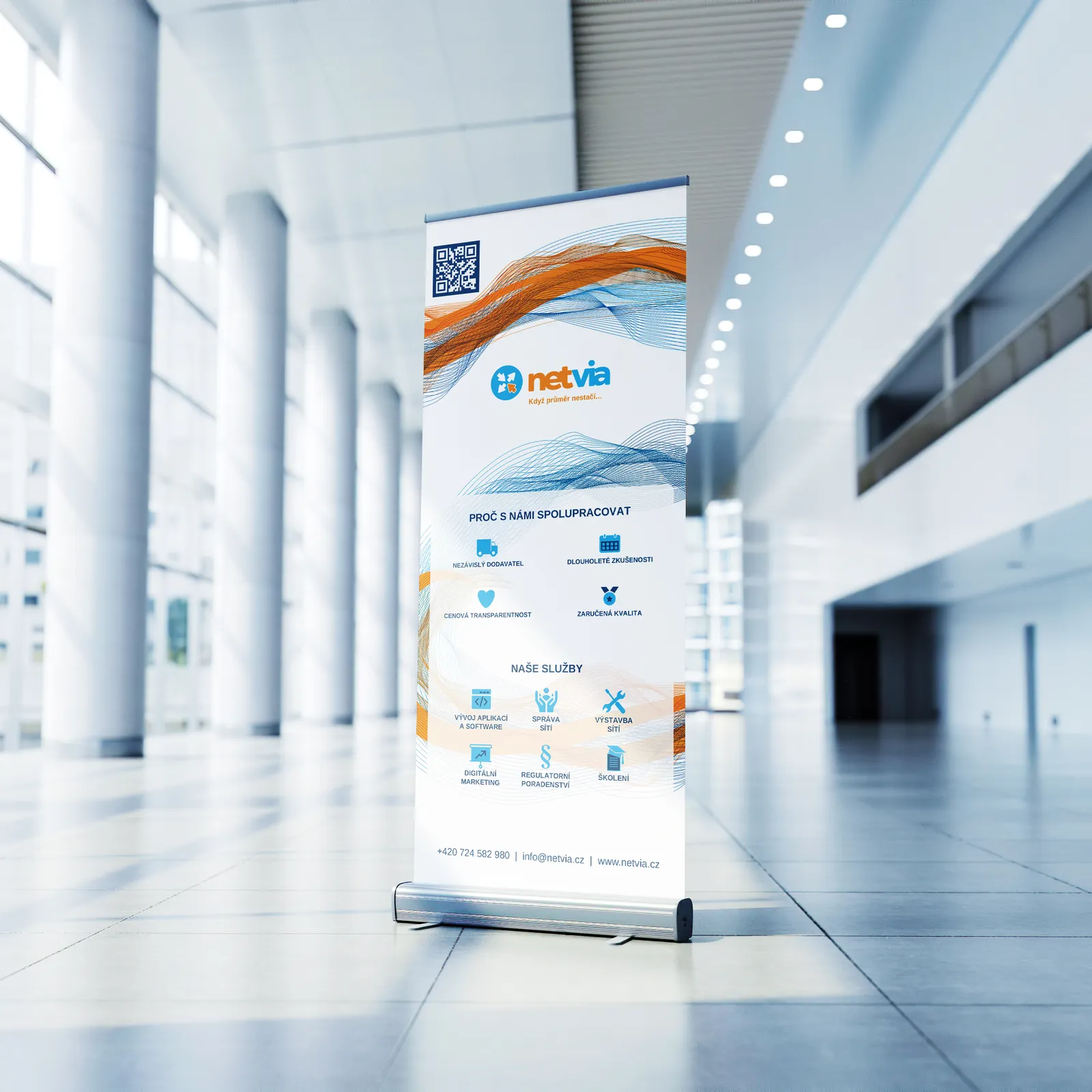
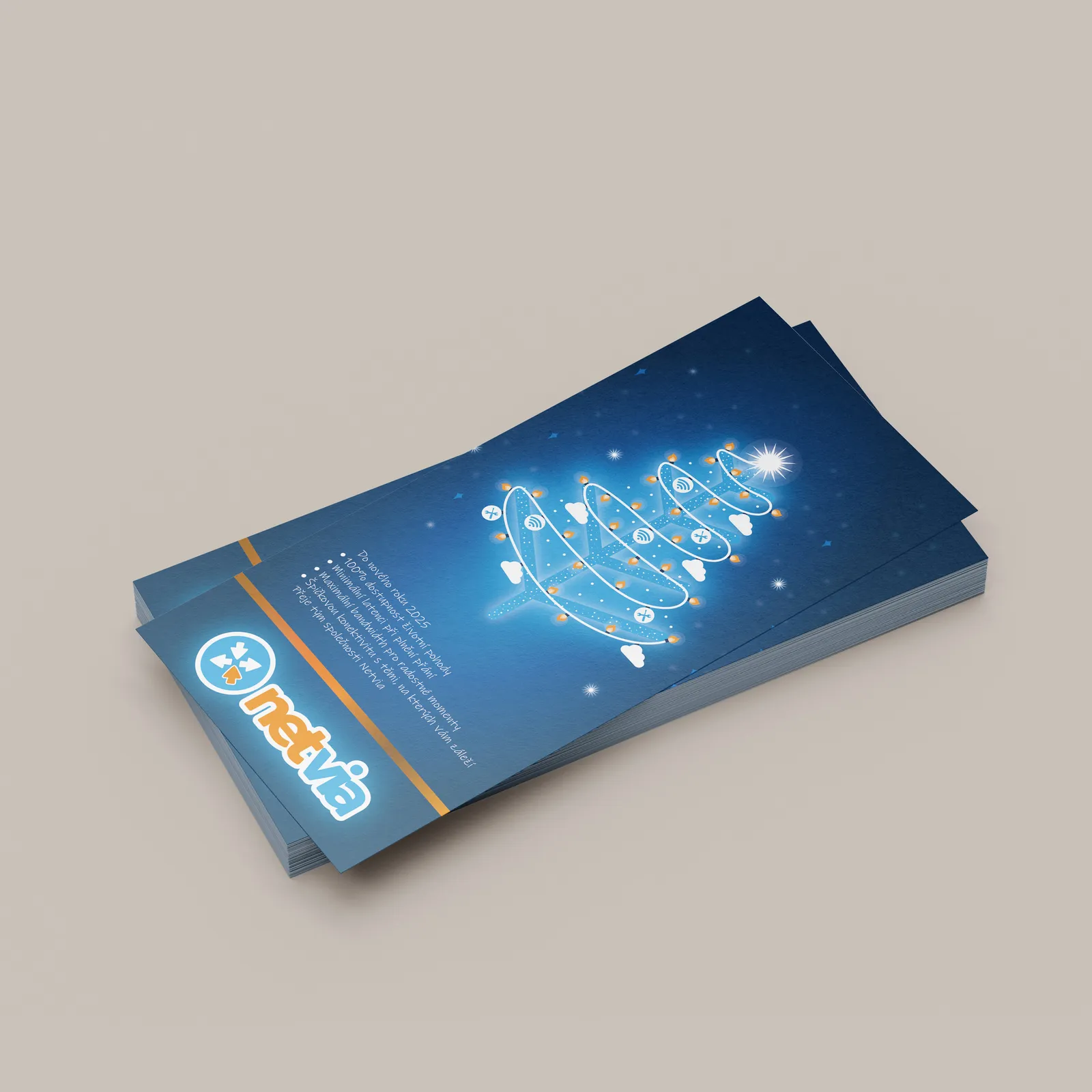
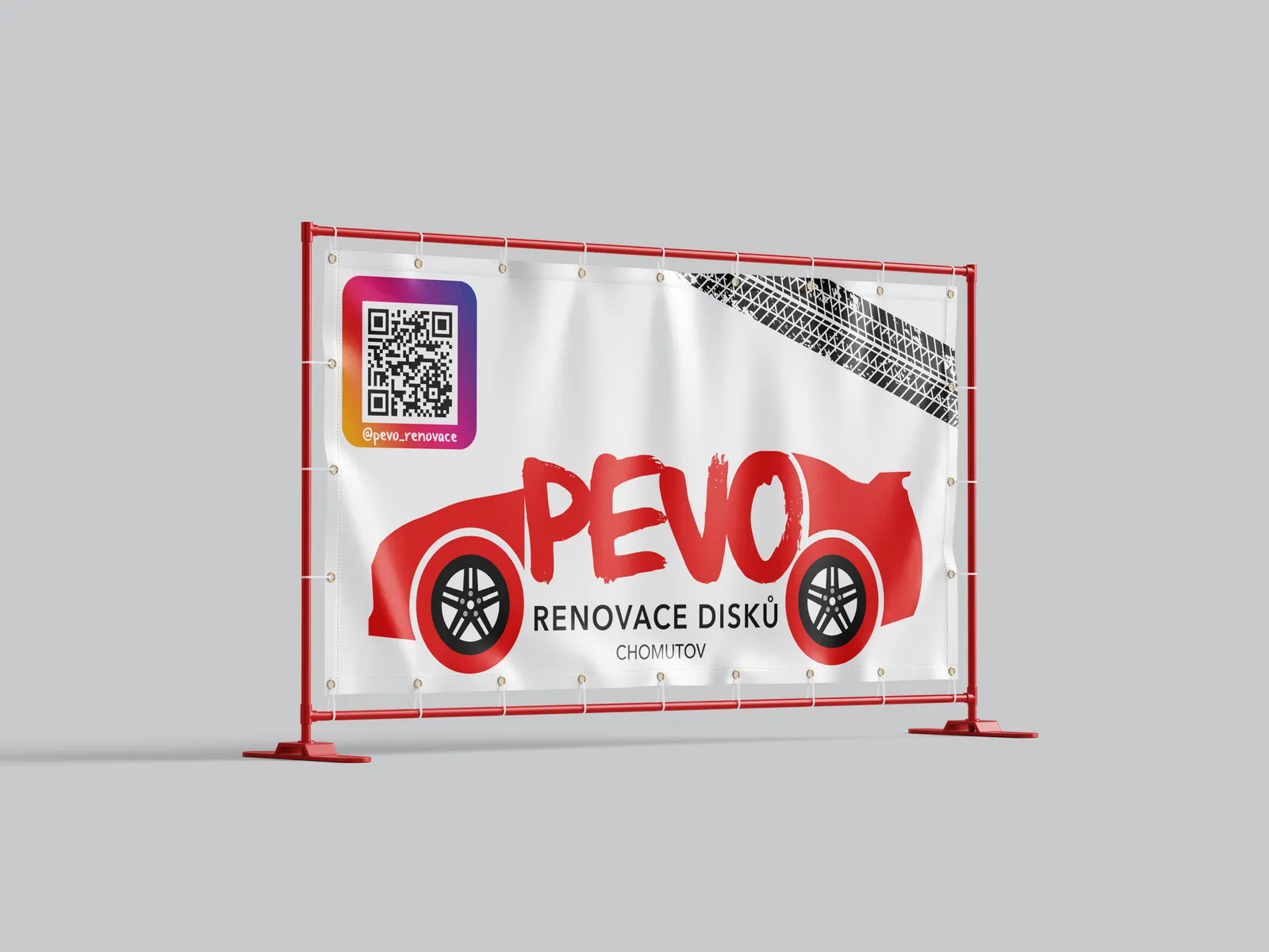
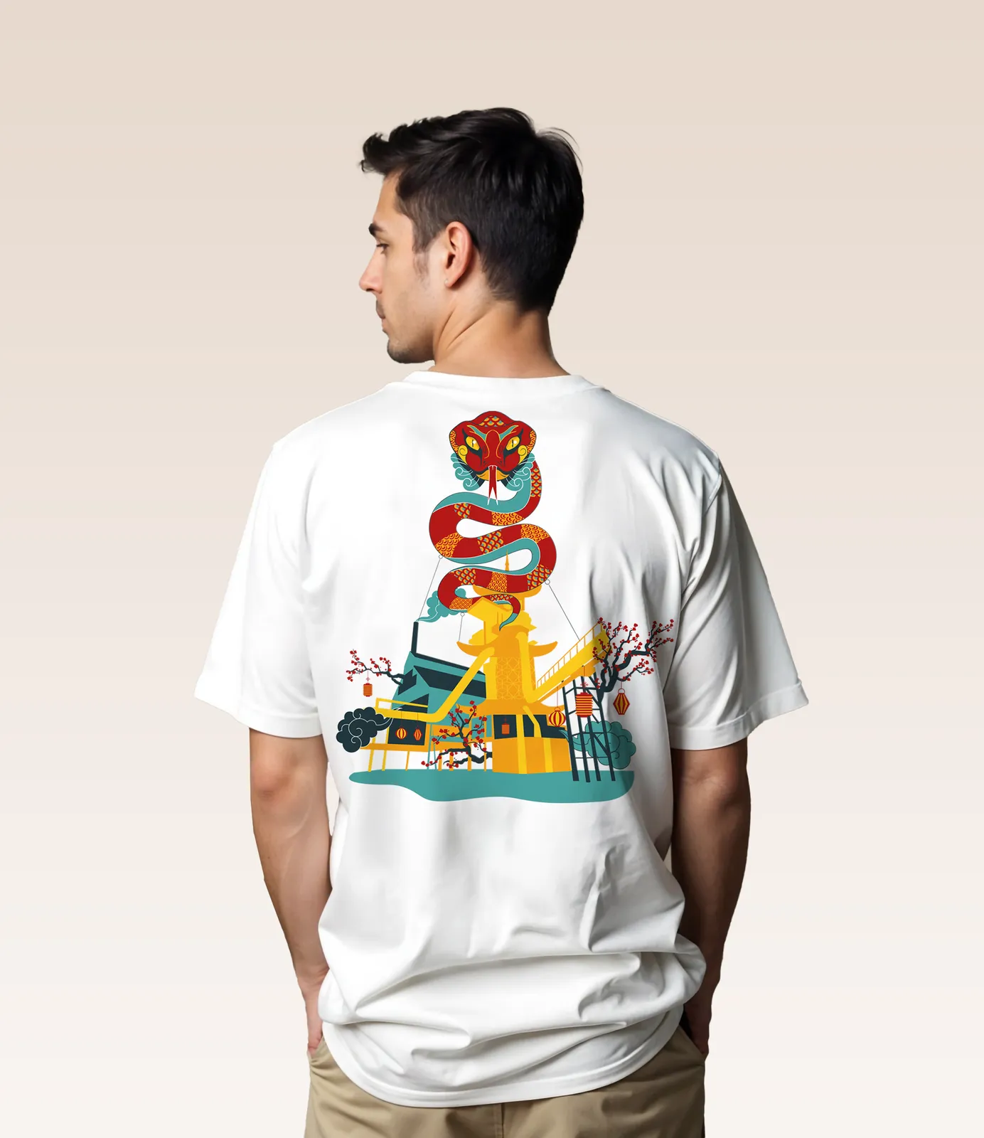
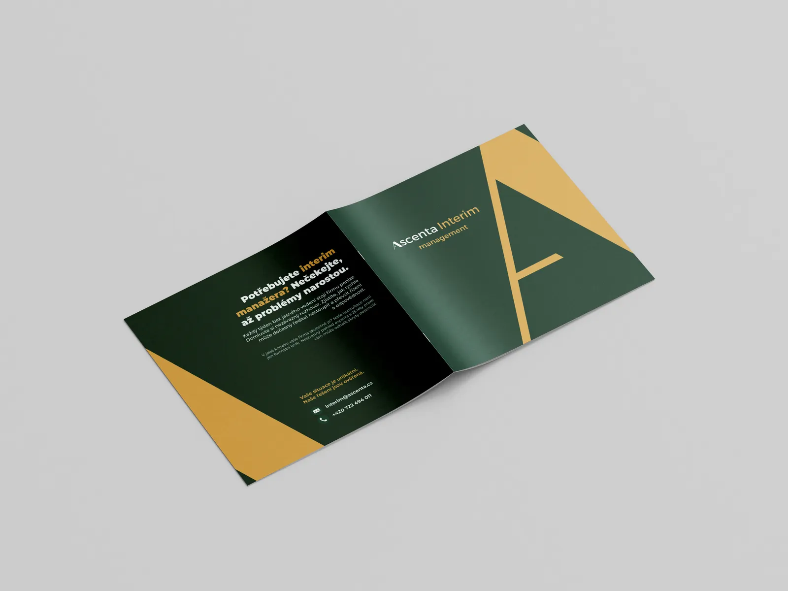
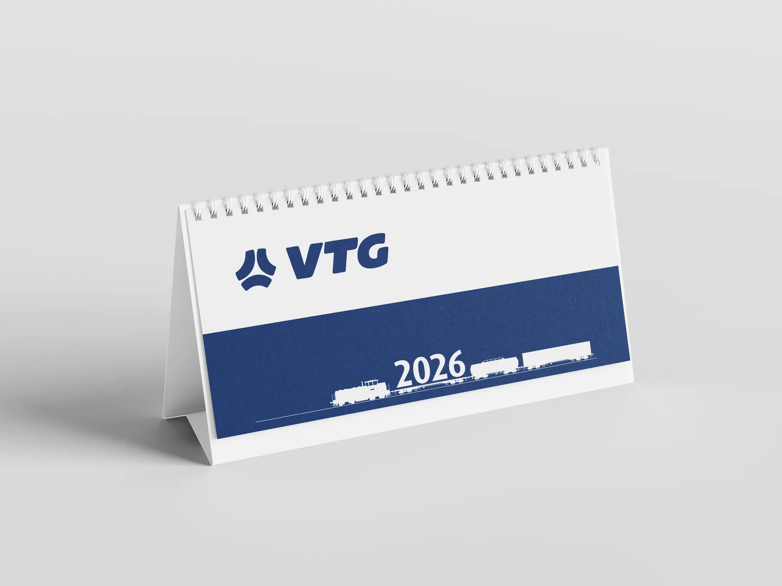
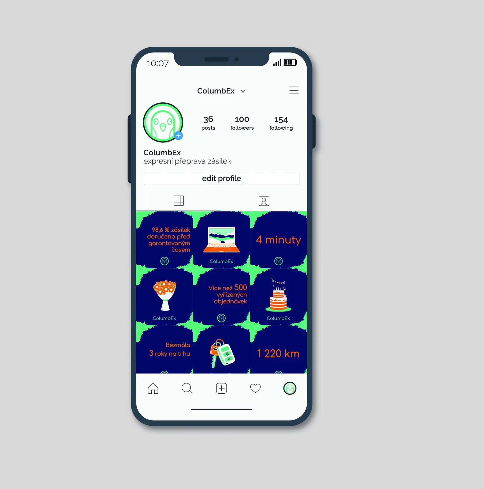
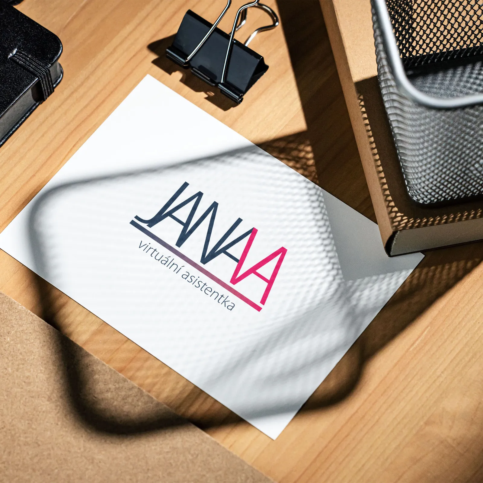
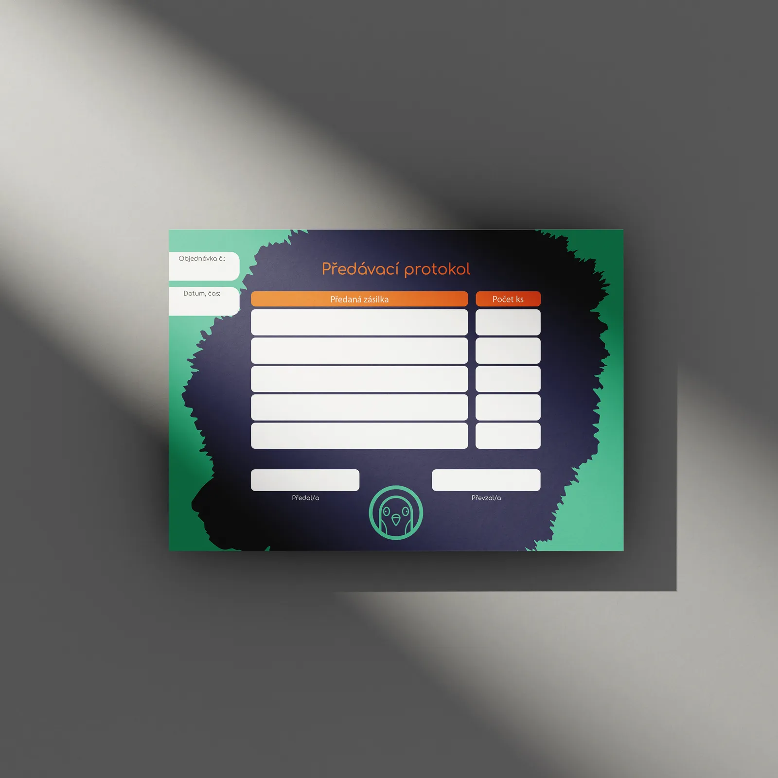
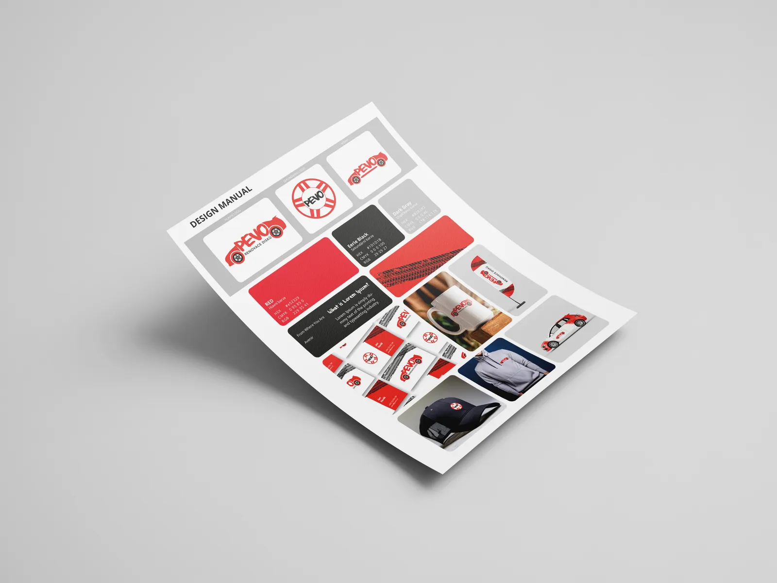
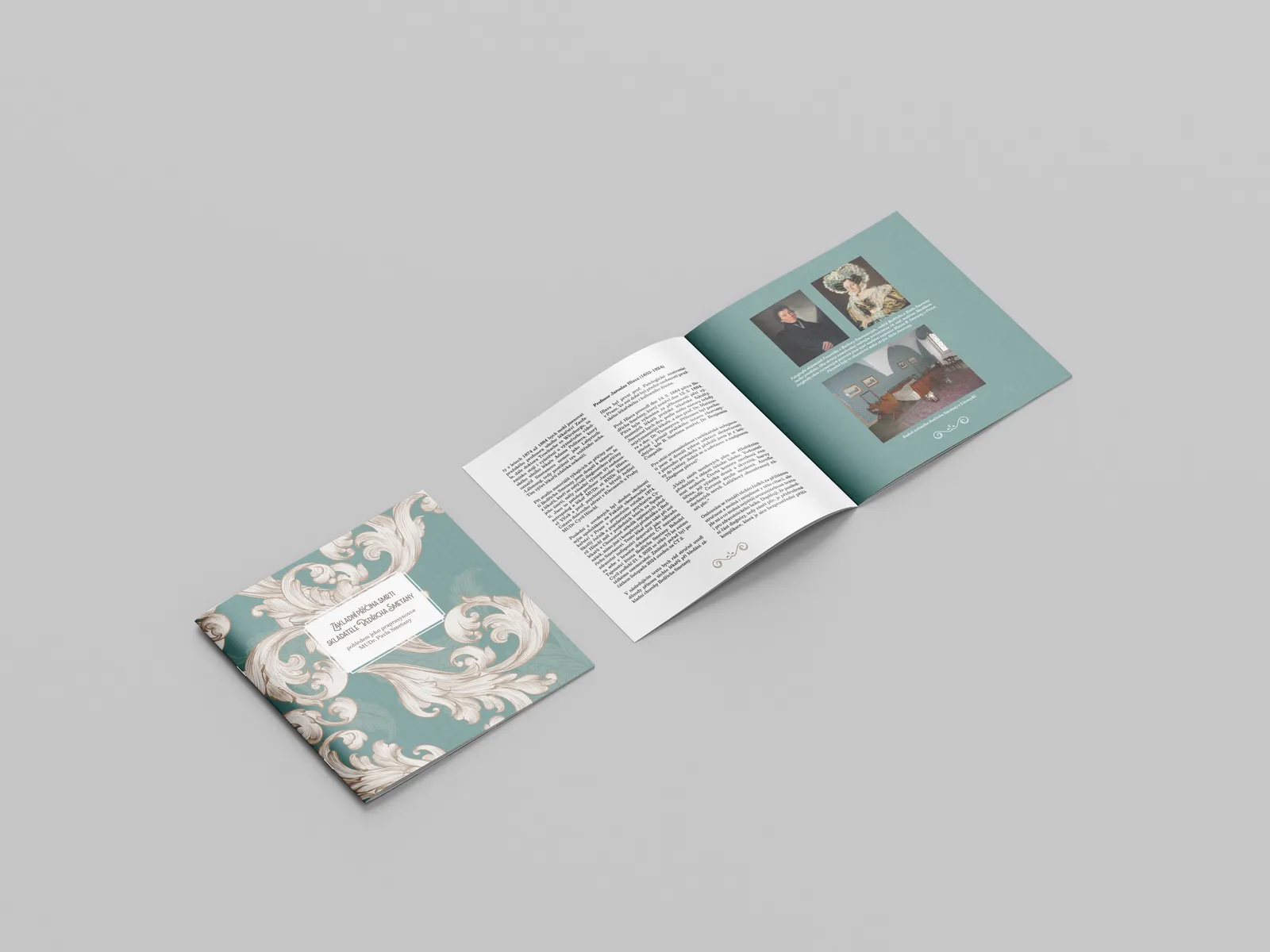
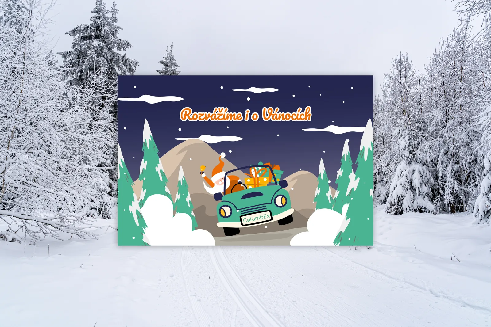
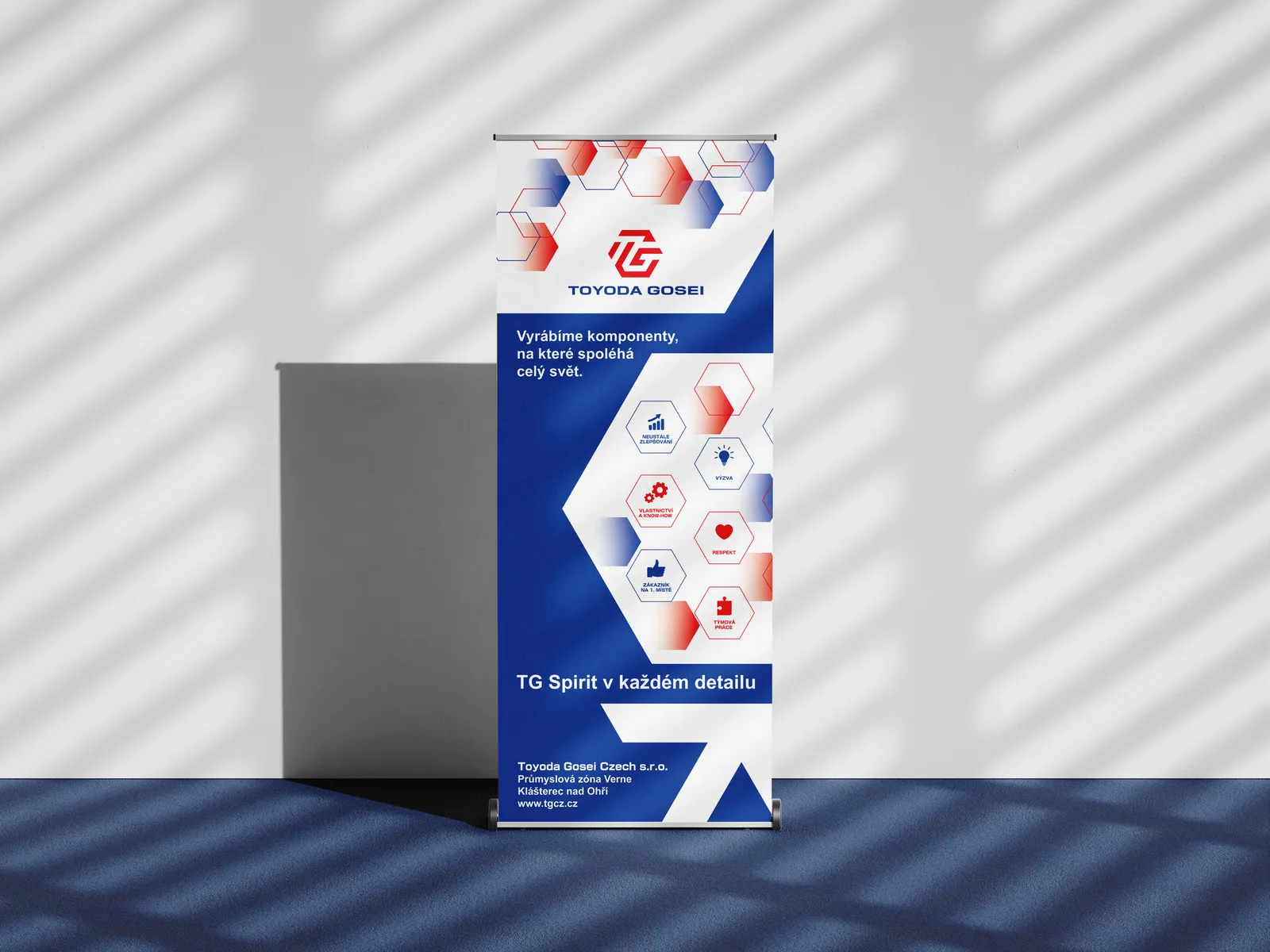
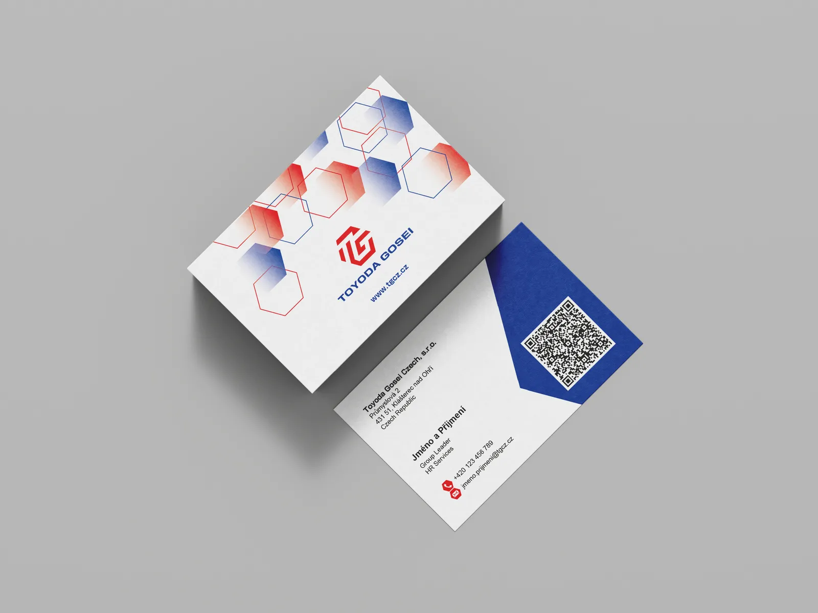
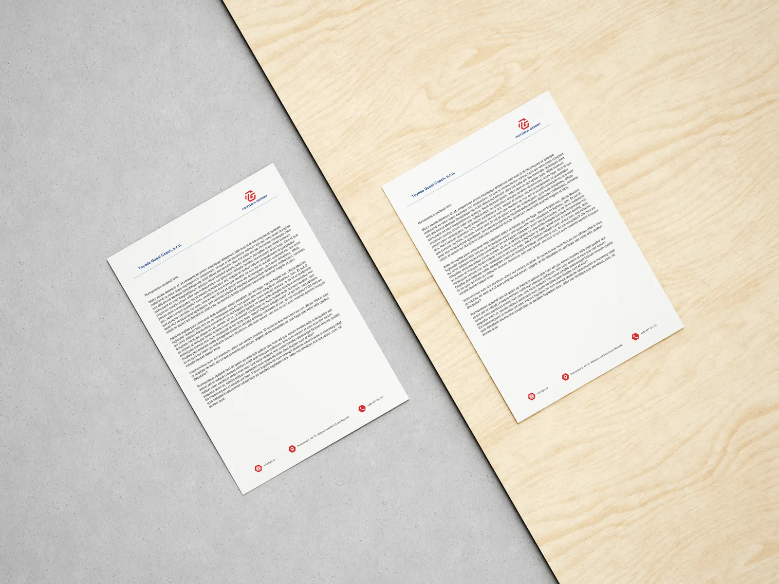
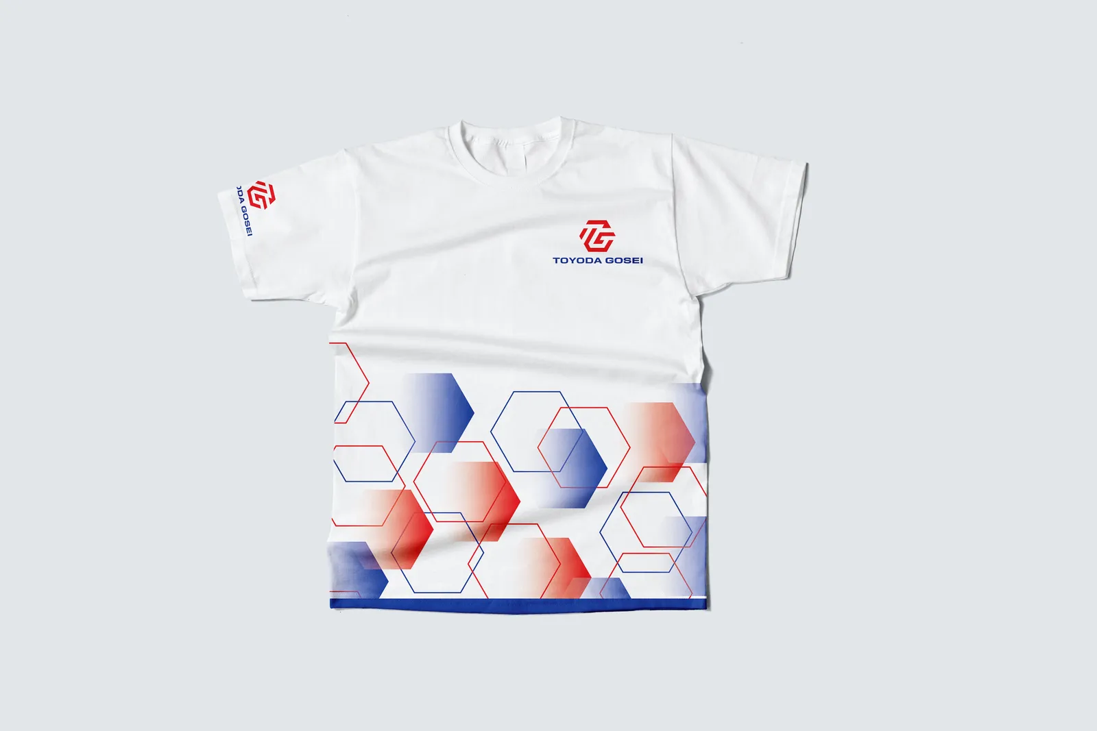
The next project was a full visual overhaul. Redesigning all the company's materials while staying within their corporate design guidelines. The result is a unified visual system now used across every touchpoint, from trade fair stands to everyday office life.
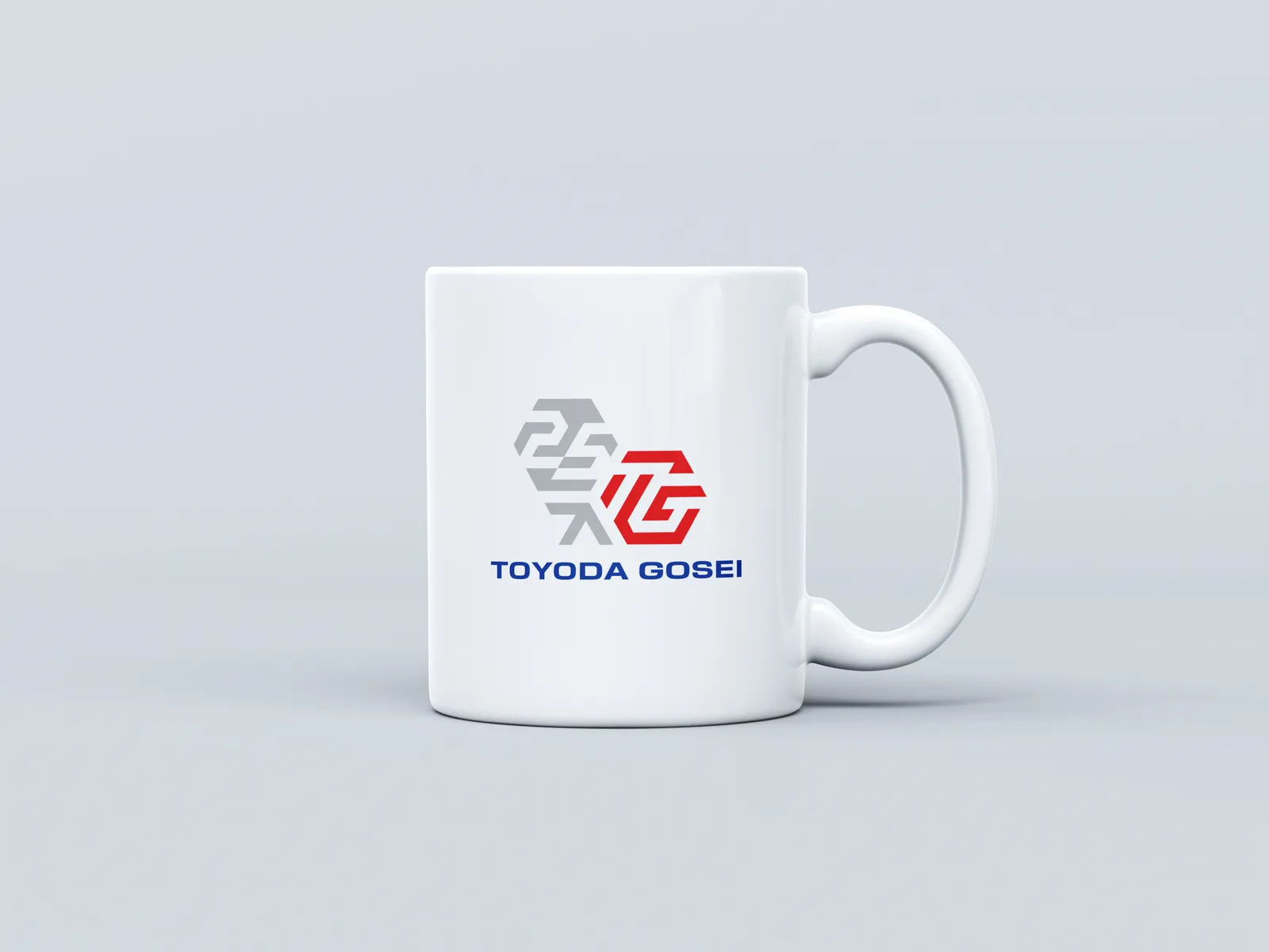
The scope covered exhibition and presentation materials, corporate documents, branded workwear and accessories for company events. The client took the new identity and made it their own and for us, that says everything. The collaboration is ongoing, with the system continuing to grow into new areas.